Pages

Monday, May 28, 2012

weekend garden check

I'm gonna try real hard to take pics of the garden each weekend so that I have a visual record of how things grew. Or didn't. Our tomatillo plant looks like a gonner but I'm not gonna yank him yet cause he's actually got one teeny little tomatillo growing. It's about 1/4" in diameter but already has the faceted sides. Very cute.

All the trees look good. The peach didn't drop all the little peaches that it came from the nursery with. I thought it might from transplant shock but so far, so good. The trees have all grown a bit, as have the shrubs. The sod appears to settling in well, except for a patch out front that gets missed by the sprinkler, I think. 
Armenian cukes in the near tub, 4 different peppers in the far one. Basil in the crock. All growing like crazy.

Leslie, Maggie, and Steve between the cukes and peppers.
Maggie popped her head up at the last minute and hid my smile.
Like my dirty knees? We just got done laying plastic under
the bird feeder area and I'd been crawling all around.

Steve's test shot to make sure we'd all fit in the frame. I don't have many pics of me that I like
but this one looks like me and I like that it's out in the garden. Still got dirty knees tho.

Shot from the far left side of the patio. Left row of plants are squash, melon, and cukes.
Center row is 4 more pepper plants.
Right row is 4 more tomatoes. (Julie, we should have tons of tomatoes for your visit!)
Far right row of small plants is yet more peppers. It's gonna be pepper city here come July and August.
Shot from the far right side of the patio. 5 kinds of basil, then various herbs further down.
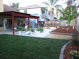
Shot of the uncovered part of the patio and the raised bed. The neighbor's huge pink oleander is gorgeous -
just my shade of pink. This is a really nice view of the yard. Can't hardly see any houses, just peaceful nature (and some concrete...) I wanna get a fire pit for out here in the cool evenings, but haven't convinced S yet.


Sunday, May 27, 2012

playing with brushes

In Photoshop, that is. I kept seeing brushes this, brushes that on digital sites and finally downloaded a bunch of freebies from this great site. Then I opened a background of aged tan paper and cruised thru the teeny weeny thumbnails of the brushes and tried all the interesting looking ones on the page. I didn't have anything in mind when I started, just wanted to play with brushes enough to see if it was something I wanted to use in digital layouts. The answer is a resounding YES and I ended up really liking the random look of the test page.

There's a bit of everything on there. Birds, trees, splats, spilled coffee stains, flourishes, rain drops, splashed water, grunge marks, cracks, post marks, wings, vintage postcard backs.

back to swappin' ATCs

I dropped out of the swap thang for a while. Too much to do moving, etc, but I miss the direction and the deadlines, soa few weeks ago I trolled ATCSFORALL.com until I found a few I liked.

This first set required that you (1) make a watercolor background, then (2) stamp with a stamp that had some open areas. I didn't really have anything like that, so I used this circular month stamp 3 times to create open areas. Then you had to (3) zentangle in the spaces, then (4) shade and highlight the tangles.

For the background, I ran drips of yellow and aqua the long way down a large sheet of watercolor paper, dried it, then ran more drips the short way of blues and greens. Gave it a few sprays of water here and there to help with the dripping and ended up with a sort of plaid pattern. Loved it. My watercolor efforts often usually almost always fall short of my expectations, but I liked this one a lot.

Stamped the stamp, spent a few evenings tangling away, did a lot of shading and a bit of highlighting, and called it good. I'm not the world's greatest zentangler but I enjoy it and had fun with these.


I used more of the same paper for a theme that required you to use a time piece somewhere on the ATC.

put a bit of tea bag over the 'long gone' text to fade it out a little
I stamped a large clock face partially off the card, then pasted a torn piece of used tea bag over it to soften the edges. I had some gel medium transfers laying around and used those. I drew around most of them with markers of various kinds, just sort of playing. Added a bit of washi tape at lower right. Found some text that went with each image. Did a bit of inking on text and edges.

Slathered some gloss varnish over them to protect the fragile pieces.

At first I wasn't real sure about the vintage images on the modern looking watercolor background but now I like the juxtaposition.

the text is part of a label from vintage embroidery thread

no, I don't know why she's apprehensive, she just looks it

This one's a little different in that I auditioned a background stamp of clock faces
before deciding not to use it on all of them. The woman is layered over some paper
from the back of a photo of a dead child that my MIL gave me years ago.
She was the daughter of a grandmother's sister or something. Neat paper.

Saturday, May 19, 2012

POW!

My other half plays basketball and comes home with various injuries now and then. Bent fingers, scuffed knees, etc, pretty much what you'd expect. But about 3 weeks ago he caught an elbow on his cheekbone and came home with a doozy. We work together, so he had to endure all the "finally really pissed her off, huh?" comments from the guys.

It was HUGE and hard as a rock. Literally like a golf ball stuck in there. Crazy.

After 2 days, it looked like this. Still a lump but going down and turning all sorts of colors.

About a week later, it looked like this. Starting to turn green around the edges. So attractive.

O.M.G. my new yard!

We moved a few months ago, I may have mentioned that or not, can't recall. Bigger kitchen, nicer back yard. Altho not as nice as we wanted, so - somewhat unbelievably - we hired someone to do the whole thing, front and back, just the way we wanted. It's been going on for 3 weeks - mud everywhere, piles of yard tools, wheelbarrow tracks all over, mountains of rocks - and today when I got home from work, it was all done.  After a lifetime of mostly living with whatever came with the house, I finally have a yard I absolutely love.

Front Yard
BEFORE: not my cat, ugly hedge, rocks everywhere

BEFORE


DURING


AFTER: Little paver patio for bench with blue star creeper in between,
hydrangea in front flower bed.

AFTER: flower bed and lawn

AFTER: street view - gorgeous!
Can't wait till the flower bed grows up a bit.


BACK YARD BEFORE: patchy lawn with holes from previous dog


BEFORE: boxes of rocks from yet another rocky area, dead lawn

gack!

During:
DURING: big pile of awful dirt that went away

DURING: the trenches! The dog loved these.
She'd hop down into one and trot along,
all you could see was her tail.
Looks like Afghanistan to me.

After:
AFTER: WOW!!! Sod, shrubs along back.

Raised bed that was already there, planted with fruit trees and veggies.
Pear, plum, peach, nectarine and apricot.
Already have some veggies growing in tubs and buckets.

I just love it. Despite having neighbors all around,
it's quiet and lovely to sit out there in the evening.

View from the back corner with my tomatoes in paint buckets
left over from doing the inside of the house.
They're the perfect size and much sturdier than the pots I used to buy.
And free if you don't count the paint!


the shrubs: also have a lilac and a weigela further on around to the right.
These will be so pretty next spring and summer.
All pinks, purples, blues and whites.

Thursday, May 3, 2012

half my life

I've always loved this line from the song and had enough time over the weekend to sit down and really spend some time playing in photoshop.

This is the most complex digital collage I've made so far and I'm quite happy with it. The little girl isn't me but I love her frizzed out hair and wistful little expression. I extracted her with a rough edge so that she blends a bit with the book. Added the torn paper peeking out of the book.

There are two papers plus an overlay for the background. Added the grungy cluster along the left, the turquoise sparkly sequin waste circles, the black dot curlycues at left and the top and bottom banners. I erased part of the paper clip to get it to look right, and tinkered with drop shadows but I'm doing them the lazy way, using the photoshop one instead of creating my own. When I have more time, I'll learn the better way. Did a lot of copies with different blending modes to get it all soft and oldish looking.

Love the font. It's called Crow Scratch from Crowabout Studios. She makes a lot of neat stuff. Most everything else is from Scrapbookgraphics. I've got to go find that macro that keeps track of every element you use so that it's easy later to give credit to all the right sources.

zetti cats

ATCs made for an online swap. I painted ATC-sized pieces of watercolor paper, then collaged various bits and pieces cut from a couple magazines. The legs are a border stamp that worked well for the typically striped legs of zetti creatures. I hand-cut a cat head stamp from an eraser and drew on the tails by hand. Doodled here and there with black and white gel pens. The little banners are a stamp. I added odd text from whatever papers were on my work table and wa-la - zetti cats.

I like zetti things and can't wait to see what I get back. And I'd forgotten how much I like to make ATCs. Such a defined small space which works well for start-but-often-never-finish me cause I can always see the light at the end of the tunnel.