Pages

Thursday, February 28, 2013

cherry blossom pink

A digital collage made for the Art Journal Caravan 2013. This month's stop on our around the world tour is Japan. I'm not a huge fan of Japanese art, culture, food, etc. Don't dislike it, it just isn't a country on my bucket list.

However, it has a lot of neat things going for it such as cranes, mountains, cherry blossoms, and haiku.

For this collage, I used 3 background papers from the March kit layered and blended in a variety of ways, then added the various elements.

I wrote the haiku which reads:

cherry blossom pink
sparrows soar in aqua sky
nature sighs softly

abstract gelli postcards

Figured you were getting tired of all letters all the time (I finally was too), so here's some postcards.

I started with gelli printed cereal boxes cut to 4x6, then collaged more gelli printed deli paper and phone book pages, dress patterns, and the tiny filter from a used Keurig cup. 

I didn't even know there was a filter in there, but we just bought a tumbler composter and coffee grounds is one of the things you can put in there, so after S brewed a cup, I ripped the top off and shook out the grounds. 


It looked like there was still more in there, so I scraped at it with a knife, then got real interested and took it all apart. There's a little filter that looks kinda like a small cupcake paper, and a small plastic piece that sort of supports the filter.

Anyway, I cut it up and used it on some of the cards. It's the dark semi circular thing. I like the crinkles in it even after I smoothed it out.

I used matte gel medium to stick everything down cause I've discovered that glue sticks don't hold very well on gelli prints. Don't know if it's the slightly rough texture, or the nature of the paint, or what, but I'm not taking any chances in the future and will stick with gel medium. Don't want all my bits falling off in the mail!

I had a couple random word strips from books lying on my work table (along with so much other stuff right now), and stuck them on two of the cards. I'm calling these done for now, altho once I decide who they're going to, I may add recipient-appropriate stuff.


Monday, February 25, 2013

LL201 lesson 5

What's this - my fourth post today? Can you tell my husband's out of town?? Haven't done a lick of housework so tomorrow morning will be a flurry of dishes, laundry folding/putting away, etc. 

Altho today I did repot the front planters with flowers, so that counts, right?

Struggled making this look like a collage. All the words are supposed to touch, and Joanne's sample is all filled in and co-joined, etc, while mine looks like a crossword puzzle gone bad. Too all-lined-up, altho looking at it small here in the post editor, it looks somewhat better. 

All the words are from a list of the most beautiful words in the English language. Love the way some of them roll off the tongue. Word candy.

But this is my 3rd try at it and I'm calling it a day and going up to read in bed with hot chocolate, a cookie, and the dog, and maybe the cat if she's feeling sociable. The bird's already in bed. Night.


LL201 lesson 4

omg... what a train wreck.

Not the whole thing. It started out pretty good. I had a plan to work from Z to A and it went just fine. Letters penciled in, then markered in - so far so good. (they're supposed to look like they're disappearing down the center. yes? no?)

The wheels started to come off when I got out the paints. Actually the Inktense pencils. And actually, that part mostly went ok.

Until I added a gray and a red to the lovely mix of greens and blues I already had going. Should have stepped away from the table right there. But I didn't, of course. I added more color to the bad parts, then a little more.

Still bad. Maybe worse.

Got out my little Windsor & Newton watercolor set and proceded to really mess things up. Oy.

But then I got kind of into playing with the watercolors and quit worrying so much about the actual assignment.

So... think the next class I sign up for should prolly be painting, except I've tried that and I just don't have the gene. On to lesson 5.

Sunday, February 24, 2013

LL201 lesson 3

Knocked this one out during the Oscars. Are they weird this year or is it just me?

Tasteless jokes - "we saw your boobs" set to music? Reeeee-lly? Did you see the look on whatshername's face when they flashed to her? She was disgusted. I got no problem with the word 'boobs', and I guess if you showed 'em to the world on the big screen, maybe you shouldn't be offended by a song about it, but... really?

Flat repartee between the presenters. A couple of them were so stilted that I kept waiting for someone to pop in and say 'hahaha, just a joke, here's the real thing', but they never did.

The musical numbers are great, but the rest of it just seems strange.

Loved the big Les Miserables singfest. I've never seen Les Mis in any form but I'm going to see this one. Anne Hathaway... looks like she deserved that Oscar.

Anyway, back to the real topic of this post. The drill here was to make a bunch of alphabets, vertically, on a two page spread. I lined it out and went to work (after perusing dafont.com for ideas).

Nothing real original here but the exercise definitely makes you think about it. Fat, thin... square, round... straight, curly.

Sub-par pictures courtesy of crummy evening lamp light. Sorry.

Charlize Theron is gorgeous. Just sayin'.


LL 201 lesson 2

This was a fun one. Took me a week of working on the couch in the evenings while DH watched bad sci fi. 

Joanne supplied a whole list of words and phrases, but I had to go my own way, as usual. There are a few of hers, plus movie quotes, song lyrics, favorite foods, phrases I liked from a book - all sorts of stuff.

Dug out my huge box of assorted markers, used some gel pens, some Copics, a white Signo pen.

I quite like it and will do another one of these at some point with a more focused batch of phrases and quotes.

Learning to spell is next on my list...


I wish I had...

That's the Roc prompt for Feb.

I wish I had...

Wow. Where to start?

Grace Kelly's looks, Warren Buffett's money, Steven Spielberg's creativity?  Yeah, that'd work.

However, I hadn't thought of those things when I did my spread, so there are different wishes on the page - some real, some silly.

Used my cost-a-lot-of-money-had-to-have-them-don't-use-them-nearly-enough Copic markers and had fun blending the various color families. It's not a sun or a flower. It's just a many-armed design element. Black marker, pencil for shading, gel pens. 

It was fun and I like how light it feels with so much of the background showing. Also like the black/white dashes around the center. 

Practiced my lettering by trying to make each one different, a la Joanne Sharpe's Letter Love 201 class I'm taking. 

Added little drawings or words to some wishes. (the 'more time to art' comment is 'picasso... monet... leslie...' hahaha

Just for the heck of it I added a little spider and web like I used to do on all my crazy quilts. 

Another case of it didn't quite fit on the scanner, so I pasted the 2 halves together in PSE 11 for the top pic.


Friday, February 22, 2013

Feb followers giveaways

A small thing that bugs me sometimes is when a giveaway consists of lots of cool stuff and it all goes to one person. I prefer the kind where more people win. 

In that spirit, I'll draw 3 names from my followers on Feb 28th and they'll each get one of the pictured postcard made by me, plus a gelli postcard that hasn't been embellished yet that they can do themselves.

The images are all from a 1946 The American Home magazine that I picked up someplace or other.

It certainly depicts a simpler time. And lots of household appliance ads - vaccuum cleaners, stoves, automatic coffee makers! 

Lots of booklets you could send away for, most of which cost only a dine or a quarter. 

The magazine itself - all 12"x15"  and 136 pages of it - cost only 15 cents. Crazy.


stencil alert

Hot stencil tip - Home Depot. 

I was in there this morning for a caulking gun and silicone for our new composter, and while I was wandering the aisles, I spotted stencils. 

Inexpensive stencils, to boot. Only $2.98 each. 

I bought the one pictured here as it was the only over-all pattern. There were 4 total, a couple of which are shown on the back of the packaging. It's nice plastic, would work great with paint, sprays, gelli printing, etc.

It's 8.5x11" so it will cover the medium 8x10 gelli perfectly. Hope to print a few with it over the weekend, so will update then.

Also have the Feb giveaways made, will post about those tonite hopefully...


Monday, February 18, 2013

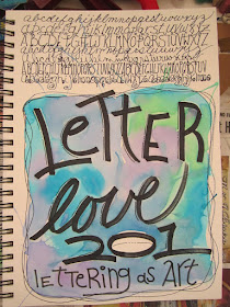
Letter Love 201 - lettering as art

After seeing my mail art friend Jewels' post on Joanne Sharpe's lettering class, I watched the promo vid, then signed up. 

I suspect my art friend Rhonda is going to be right on my heels at the ticket booth cause she watched the vid yesterday while here playing in the studio. 

Jewels, you should ask for a commission...

Watched the first lesson and made my 'cover', altho it's just  a page in my 9x12 Canson all-media journal. The big black letters were done with a Coptic marker and didn't bleed thru the 90lb paper. Yay.

I blew some of the paint puddles around with a straw but for the heck of it.

The bad part about working this large is that the blasted thing doesn't fit on my scanner bed so the bottom got whacked off in the top shot, but the colors are most true there. The other pics were taken at my work desk with my Canon SD1400. 


Love the places where the watercolors feather into each other. 

And I like the class so far, even after just one lesson. She's not preachy or goofy or any of the other things that sometimes annoy me about video classes.

I'm happy with this page and hope that the rest of them come out as well.


Sunday, February 10, 2013

11th hour project


Guess what's in here?

Under that old book cover?

I got a wild hair to take my kindle on my trip to San Diego tomorrow to visit my friend Julie. 

But it needed a cover of some sort so I dug out a book cover about the right size, messed around with elastic, E6000, and some fabric, and lo... a cover emerged.

Not sure how long the elastic is going to stay stuck to the inside of the book cover, even with E6000, cause it's already starting to pull up the paper. But it should make it thru this trip, then I can do rivets or something.

Took me about an hour spread throughout the day as the glue dried each time.


crazy train - Jan 2013 ROC prompt

Playing along with Roc's prompts again this year. I'm always a month or so behind so I just finished January's spread today, the theme of which was 'what personal goals would you like to have this year?'

I love the wording here. Not what goals would you like to accomplish, but which ones would you like to have? Well, I'd like to have the goals to be skinnier, and to retire sooner. I'd like to move back to San Diego. I'd like to find an art journal group that wasn't an hour or more away.

However, those are mostly not going to happen, because I'm not a magician. Well, except maybe the first one, but that would require fewer cookies and more exercise so I think I'm good, thanks. Something that I'd like to accomplish in 2013 is to make more art. I have the time - an hour or so most evenings and one weekend day - but I while it away cruising thru all the wonderful stuff on Al's internets. Art blogs. Dog blogs. Garden blogs. Horse blogs. Chicken blogs. Tutorials for the art I'm not making. Really neat acrobatic vids on YouTube.


I'm working in the journal I made for the purpose and I started out by putting down some layers of paper napkins I liked. Then began doing some lettering because something else I want to work on is my lettering. Or lack of, actually. I letter in one style and one style only and I need to break out! Add to the repertoire! But just doing the lettering for the spread about lettering depressed me so much that I glued some gelli printed paper on top of it and started over. Only this time, I grabbed a photo I'd torn from an art book a few days earlier, simply because I liked it. Tore it in thirds and the rest happened without any further input from me.

The journaling reads:
 "Am I the crazy person jumping off the building, taking chances? Or am I the sane normal one dutifully pedaling off to work? (I'm quite sure I know the answer to that)  Please punch my ticket to the crazy train!"

Tuesday, February 5, 2013

and yet more mail art

But this time for a good cause, the saving of the tiny little post office in Rupert VT where Jane Davies lives. The linked blog post says she owns it. I'm not sure what that means cause I thought the government owned the POs but maybe she owns the bldg? 

Anyway, it's threatened with closure so she's working on upping the volume of mail by putting out a call for postcards. The PO is a charming little thing, complete with its own chickens, so I sent a card.


Background is another gelli print (what else?), some gellied phone book page strips, and some images from a November  1946 The American Home magazine. Love the stunned expression on the little girl's face. She was from a different ad than the laundry soap. Check out the soap price - $0.75 cents for 5 POUNDS. Did some stitching for textural interest and glued it all down.


more mail art

MailMeSomeArt has a collage challenge where you have to use only the items on a given collage sheet. You can cut them up but you can't add anything. 

I cut up a bunch of old file folders from work into 6"x8" pieces and folded them in half so that I'd have a final 4"x6" postcard. Stamped a text stamp on the bare card, then glued down a sheet of gelli printed deli paper. The deli paper is somewhat transparent when glued down so the stamping shows thru to varying degrees depending on how thick the gelli paint is. Very cool look.

Then I cut out all the collage sheet pieces and played with them for a few minutes. They pretty much divided themselves into two piles - the medicine ones and the money man ones.

The medicine pile brought to mind the phrase "take two and call me in the morning" so the card came together quickly, including punching out "pills" from the blue strip of paper and gluing them down. Annoyingly fiddly little things, especially when your fingers are sticky.

 The money man pile made me think of the saying "more money than brains," so I made a card based on that. Every time I see a head cut open with things flying out, it cracks me up so I did one of those with the pennies. The other elements just sort of filled in the other half of the card. I quite like this one and will prolly make an ATC or two with those same elements.

Sunday, February 3, 2013

yellow postcards

Made a couple cards for MailMeSomeArt's current theme. 

It took me a long time to realize why I like postcards so much, but it's a simple reason: they have a finite amount of writing space. 

When I would start a letter on stationary, it seemed like I would never be finished cause there was always another sheet of paper on the box. So I'd run out of things to say or my hand would get tired or I'd have to stop to make dinner, and then the letter never got done. 

With a postcard, you have only the space on the back. Period. Then you're done and can resume your life. 

Once I switched to postcards, I became a better corespondent. Not good, but better.


gelli print freebies

Had another gelli printing extravaganza this afternoon while the Byonce Bowl was on. 

This time I did a bunch of cereal boxes for future postcards, putting layer after layer on them to cover up the Cheerios and Chex graphics.

I also did some of the folios for a journal I'm making. More on that in another post.

I cleaned up the plate in between colors with phone book pages. I like them cause they're thin and layer well, and the type is a great neutral background for collages.

The various mark makers this time were four 6" stencils, bubble wrap, sequin waste, crinkly packing paper, fruit bag netting (thanks, Rhonda!), the cardboard center from a roll of packing tape and a foam tube.


I made about 5 times as many as I'm showing here, but these are the coolest ones and a good assortment for freebies.

I'm tellin' you - if you don't have one of these goofy things, you're missing a whole lotta fun, and it's bargain fun after you buy the plate. 

The cheapest craft paints and free paper like the phone book are all you need.

All I have to say about the Stupid Bowl is that it's too bad the refs forgot what 'holding' looks like in the 4th quarter.


Friday, February 1, 2013

and the winner is...

Well, the Grow Your Blog Party is over and I count it a success. It netted me almost 4 times the followers I started with, and now it's up to me to make my blog interesting enough that you all not only stay but tell your friends!

The winner of my altered vintage postcard is Catiean of Catiean & Co. Congrats!

Catiean, I sent you an email...

Many thanks to all of you who left wonderful comments and especially to those of you who signed up to follow me. I'll do my best to make that decision a good one. 

In that vein, I think another giveaway is a good idea, so this time it'll just be from all my followers. I'll draw from whoever's  still around on March 1. Not sure yet what the goodie will be but it'll be something handmade by me. Once I figure it out, I'll post about it so you can see what you're hanging in there for.