 |
 A marvelous place for all things digital is Scrapbook Graphics. I forget how I first found them but they have a great line up of designers (altho I mostly buy from just a few whose work really appeals to me) and an active online community with monthly challenges, contests, classes, tutorials, etc, that I'm participating in more and more.
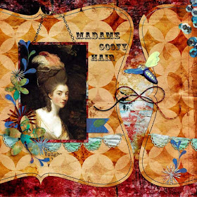
One of the challenges for December is in the section they call the Launch Zone and this month the challenge was to use the provided template (first image). I'd never used a template before and didn't have much of a clue what to do, so I printed off the tutorial they linked to, opened up the trial version of PS CS6 that I'd just downloaded and went to work.
Talk about a learning curve... new program, new technique. Oy. Made my head hurt. But I fired up the Keurig, made a hazelnut cappuccino, and struggled thru the first twenty minutes until things began to make sense enough for me to move right along.
So the 2nd image was made in PS CS6. The photo is my great grandpa around 1895, dressed up like the town dandy, posing in a photo studio.
I made the 3rd image in Elements 11 using the same template. I figured doing the same exact task in both programs would go a long way to reassure me that I could do just fine with Elements and save the PS CS6 money for something else, and it did. I left most of the template elements intact because I wanted to see the program difference between the two pages when I was done and not be distracted by different elements. I like them both altho the colors in the blue one appeal to me more.
credits: template - Rosey Posey, flying bee - Lorie Davison Quieter Than Daylight kit, all other elements - AJC12 and AJC13 by Tangie

No comments:
Post a Comment