.......a little photography, some mixed media collaging, a bit of Photoshop experimentation...
Wednesday, June 27, 2012
Monday, June 25, 2012
dandelion goes b/w
Kim Klassen is having a texture... challenge, I guess, altho she isn't calling it that. You just need to use one or more of her many free textures on a flower photo. It starts tomorrow and I assume she'll post a way to link a blog post, so I'm getting ready now.
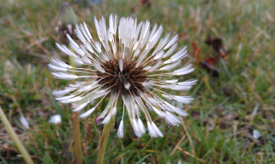 I started out with a dandelion image I took a few summers ago, in our front yard. Cropped it more or less square, then duplicated it. I began dragging Kim's various filters onto it, playing with the opacity and fill percentages. (Honestly, I don't even know the diff between those two things, I just adjust till I like the look. I really must learn more about PS.)
I settled on one called luminous - darker around the edges with some just barely visible text. Changed the duplicate layer to multiply mode. Played with levels until I had the white tufts positively glowing, made it a little more contrasty. I liked it well enough but it wasn't really blowing my skirt up, to borrow a Pioneer Womanism.
Then I had the brilliant idea to desaturate it. That did the trick. Gave it a vintage look, like a faded old picture you might find tucked in the pages of a book, forgotten on some long ago summer's day.
polyvore #1
Made the mistake of thumbing thru Sommerset Digital Studio at the bookstore on Sunday morning. It has articles on digital art making, specifically Polyvore and phone apps. The issue came home with me and within 48 hours I'd signed up for Polyvore and made a collage. Definitely different from Photoshop, and I haven't got it all figured out yet, but I like my first effort and some of the art others have done is spectacular.
I started out with the pink paper. Added the floor plan and the window, thinking to make some sort of statement about houses and homes, but then I kept finding more elements I liked, and I couldn't figure out how to grab elements that were already buried under other elements, so it became something else. I custom-cut the banner from an image, flipped it, layered some text over it to knock the brightness down a bit. Liked the circle imagery so I added them with no real plan. Finally put a paint splatter in the window cause it looked too bare. Pretty fun. This would make a good journal page background. Feel free to grab it.
So... I'm hooked. Yet another art form to dabble in.
apron face
Julie FFB paints faces that I like. She paints them on purses and canvasses, and today I got a wild hair to paint one on my working apron. Without much more thought than that, I drew a rough outline, put in some features with a black marker and starting adding color. What a hoot!
I had no one in mind, no image in my head that I was working from, but now that she's done, she reminds me of Angelica Houston., with those bangs and that mouth and those high cheekbones.
Sorry, Angelica, if you should happen to read this - no disrespect intended.
I had no one in mind, no image in my head that I was working from, but now that she's done, she reminds me of Angelica Houston., with those bangs and that mouth and those high cheekbones.
Sorry, Angelica, if you should happen to read this - no disrespect intended.
Tuesday, June 19, 2012
book review Layered Impressions
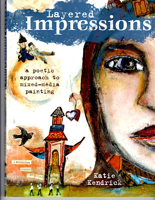 A couple Mondays ago, after stocking up on fruit and veggies at the farmer's market, I spent a blissful hour in our big Barnes & Noble (book store), parked in a chair in front of the craft shelves. Found a few books I liked but the one I brought home was Layered Impressions by Katie Kendrick.
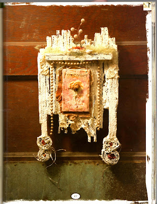 I LOVE this book. The projects are everything I like - a bit grungy, use a lot of stuff I already have on hand, plus recyclable things like cardboard. They're useful, for the most part. They're a bit slapped together without a lot of fuss for making sure corners match and that sort of thing, so you sort of can't go wrong.
They also leave a lot of room for making them your own. Some folks like to go to a class and come home with a project that looks exactly like the instructor's class sample. And that's fine - for them. But I'm the one who has to use blue when the instructions say green, or make mine 6" when it should be 8". Whatever, I'm always tinkering with the way it should be, and Katie's projects totally lend themselves to that.
Right now I'm about in the middle of making the white wall piece in the second image. It's made from corrugated cardboard, joint compound (that you seal up drywall seams with!), dried flowers, old beads - all sorts of fun stuff. Slapping the joint compound all over it was a blast. I just this minute finished painting some melted beeswax over my little flower panel, the part hanging down with the flower on it. My first time doing the beeswax thing which I've admired from afar for quite a while and it looks cool!
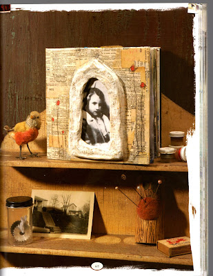 Then I'm gonna make the 3rd image and then the 4th. So I have several weeks of projects planned out from this book and there are several more that appeal to me. If these pictures appeal to you, go get the book! I don't buy many art books because I've found that I like one or two things in them and then they just sit on the shelf. This one is practically dog-eared already from all the paging thru I've been doing.
Thanks for a great book, Katie!
cool garden idea
My San Diego friend Julie sent me this pic from a community garden in her neighborhood, so I'm not taking credit for the idea, just passing it along cause I think it's neat.
Stick a tall piece of rebar in the ground. Slide large clay pots down the pole, staggering their tilt left and right. Fill with dirt and plants. This one has strawberries in it, but you could do any trailing plant to good effect. I see one (or more) of these in my garden next year...
Stick a tall piece of rebar in the ground. Slide large clay pots down the pole, staggering their tilt left and right. Fill with dirt and plants. This one has strawberries in it, but you could do any trailing plant to good effect. I see one (or more) of these in my garden next year...
Monday, June 18, 2012
art, lately
Staples had the 48pc set of Prismacolor Premiere colored pencils on closeout at a ridiculous price and... I succumbed. These are the good, creamy ones that make thick, rich colors and blend well. Not that colored pencils are my go-to mark making tool, but I've seen so much neat work using them that I figured it was time I learned how, at least a little.
While S was watching bad sci-fi the other night, I joined him on the couch with my cup of pencils and an ancient sketch pad that had one full and one partial sheet left in it. It's a Strathmore 400 series 8"x10", and I don't know how long they've been making these, but back when I bought it, it cost $1.65. I looked on Amazon just now and they're $5.75. My, how things change.
Faces are not something I'm good at but that's what I worked on, along with a weird flower that I mostly used to try colors out on. I took a baby wipe to the flower just to see what would happen and it blends nicely. I'm actually pleased with both faces. Lips are obviously not my strong suit, or maybe I was going for the Angelina Jolie look. And don't ask me why she has a salad bowl on her head. Whatever. The pencils were fun and I feel a glimmer of light in the long, dark tunnel of my drawing skills.
And just as I was sitting here looking at the picture after I loaded it into the post, I see that I forgot the tiny dots of white in her eyes, so I added them to the drawing. Just pretend they're there.
I made another formula mixed media piece on an 8x10 canvas board. Pretty much followed the recipe again but in different colors. This one has a fires-of-hell look about it and I toyed with a few titles for it but ended up leaving it nameless for now. I like the juxtaposition of the dapper man in the photo and the lace and cream tones against the raging background. The little zig-zaggy things top and center at right are thin bits of cross cut corrugated cardboard. I'd been cutting strips for another project and spotted them when I was looking for things to add. Sprayed one with several inks and left the other au naturel.
garden update
There's a problem with saying you're going to do something on a regular basis. At least for me. The minute I say that, I don't do whatever it is. Kind of like the New Year's Resolution version of Murphy's Law. Or something like that. Anyway, here's an overdue garden update.
.JPG) |
| You can just see the zucchini plant, 3rd one back on the left. It's getting huge and I picked our first few zukes this morning. Three down, 285 to go... |
.JPG) |
| There's a big cuke hanging down the left side of the tub. See it there behind the leaves? Peppers are starting to turn colors, so fun to see the daily changes. |
.JPG) |
| You can just see some tomatoes beginning to ripen at left. The basil in the foreground is doing really well. Love my patio! |
Winnie kills a lemon
Winston is a red bellied African parrot. We've had him for about 15 years, since he was 3 months old. He's about 5 inches tall and got the personality of a great white on steroids. Danger, danger, danger. But he plays a lot, so he's fun to watch, and he talks. He says "good boy" and "gimme kiss" in a deep, guttural voice like a hit man whose unfortunate karma brought him back as a nasty little parrot. He also mutters the dog's name whenever she barks or dashes thru the house. "Maggie... Maggie."
Here he is in all his red-eyed glory making mincemeat of a lemon on the kitchen table yesterday. The pictures where his head is blurry is cause he's shaking it so fast the camera can't stop the motion.
Here he is in all his red-eyed glory making mincemeat of a lemon on the kitchen table yesterday. The pictures where his head is blurry is cause he's shaking it so fast the camera can't stop the motion.
Monday, June 11, 2012
promises
Thank you Julie FFB and
Lechatquitousse (the cat who coughs)! Julie's been doing a series on other artists and the one from May 8th featuring Carol Mahy-Merveille has made my week! Carol does a step-by-step of her mixed media piece and it lit such a fire in me that I've spent the entire afternoon rolling back and forth in my studio between the computer and my work table, creating my own version by following her steps one by one.
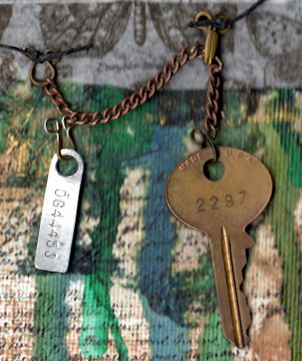
The metal items on the right came from my stash of junk I've collected over the years. The little numbers metal tag is a key code from a motorcycle. I hung it and the key from an old chain using hook and eye closure parts.
I took a bunch of process photos but then like a total space cadet, I cleared out the photos on my phone in an idiotic fit of electronic housecleaning and deleted them all. When I read about other people doing stuff like that, I smugly shake my head at their carelessness, thinking how glad I am that I'll never do something that dumb. Well, that hubris has come back to bite me square on the hiney with very sharp teeth. Consequently, I have only the finished product to show you. Beware the smugness! <sigh> But it's a glorious finished product that I am just thrilled to death with.
One of my biggest hurdles in producing the kind of art I so admire is getting enough (paint, layers, lace, elements, etc) onto the piece. I am by nature a cheapskate, unwilling to use a lot when just a little will do. However, I love the depth that only tons of layers will get you, and I have finally achieved that look, thanks to Carol's marvelous tutorial.
I started with a blank 8x10" canvas panel. Then I proceeded to do exactly what she does in the post - stamps and ink, gesso, tissue paper, ink, stencil, etc, right on down the page. I don't have some of the products she used, but I just grabbed the closest thing I had and kept going. Once the background was done, I let it dry for a while before working on the collage part. I have a bunch of old photos and poked thru them until I found one that grabbed me, added various bits from my shoe box of old paper stuff and played with arrangement until I liked it, then glued it down.

The word "promises" was sewn on my machine, a test run for a different project that I ended up not using. It was still laying on my table, along with everything else from the last five projects I've done, and with a little dye work, it was perfect. And different. Sewn words aren't something I've seen, so if it gets real popular, remember I was one of the first LOL!
One of my favorite parts of this is the way the bits of tissue paper took the ink. You can see one in the upper center of the piece, with the crinkles picking up the turquoise ink. I quite like the metal bits too. I can see several more of these in my future. Loved the process, and now that I've done one, it's loosened me up a bit to where I'll try some ideas of my own on the next one.
Saturday, June 9, 2012
phone phlowers (or maybe fone flowers)
Got a smart phone a few months ago (finally) and first thing I did was download a bunch of camera apps. Because that's what smart phones are for, right? Too. Much. Fun. My favorite one is FX Camera, and specifically the toy camera filter. But the Polaroid filter is cool too. How did I ever make it thru the day without a smart phone???
 |
| dead leaves in pink pot - this is the toy filter, makes everything a little yellowy and emphasizes the shadows |
 |
| past-their-prime roses - the toy filter again |
 |
| one of my hydrangeas - toy filter here and the polaroid filter below |
 |
| the same hydrangea buds as above only using the polaroid filter - the pink effect looks great on these flowers |
 |
| more hydrangeas, more toy filter |
 |
| same shot, polaroid filter |
Subscribe to:
Comments (Atom)


.JPG)
.JPG)
.JPG)
.JPG)
.JPG)
.JPG)
.JPG)
.JPG)
.JPG)


