Showing posts with label digital collage. Show all posts

Tuesday, December 31, 2013

AJC 2014 digital collage #1

Tangie is doing the Art Journal Caravan one last year and then it'll all be over. Right now the cost is $39.95 which you get back in the form of credit to use in her shop. If you like to do digital journaling, or want to get started in it, this is a deal you shouldn't pass up.

I recently made my first collage using the initial kit you get when you sign up. When I don't do it for a while, I forget how much fun digi collaging is. You can't make a mistake - the ink never runs, the paper doesn't tear, the glue stick doesn't get all over the place (or is that just me?) - and you can try any number of effects before settling on the ones you like best. It's very cool.

There's no deep meaning to this piece (I don't do deep), I just used elements I liked and played around with blending modes, levels and hues until it seemed 'done' to me.

Double click to embiggen the collage so that you can really see the detail.

Thursday, December 5, 2013

digital collage 'remember me'

Made in response to a call for art by Tangie of Art Journal Caravan. Everyone's submissions will be assembled into a digital book available for purchase at some point. It's at 300dpi so you can click (or maybe double click) on it for a huge view.

Started with two background papers blended with a grungy overlay. Added some stamps, blended in.

Used many images of my mom, Virginia, and her mother, Theresa. (mother theresa - ha!) She's the center image and the two going down to the left from there. She was dead at age 36 from breast cancer.

Used digital washi tape on most of them, staples on one and a paper clip on another. Added a butterfly image.

Added a cluster of flowers at lower left and some layered old papers at lower right.

I'm really happy with this. Love the color, the grunge, all the vintage images, the stamps in the background.

Thursday, January 24, 2013

digital collage Time is a Circle

Inspired by all those gelli prints, I used two of them - the aqua with squares and the rustiest of the white-ish ones - as the background for this digital collage.    

The angel is a photo I took at our local cemetery.

The two brownish elements along the left side are ephemera from the CRenee Authentic Artistry II collection.

The black stamps (the overlay type things like the circles of music and the upper right corner design) are from the CRenee Collective Memories Stamps.  You can search for both those collections here in Christina Renee's section of Scrapbookgraphics.com. 

I did a fair amount of duplicate layers with various blending modes until I liked the look. The word 'time' was a prompt from week two of the Art Journal Caravan 2013. I'm just finally getting around to using it.

I'm not at all religious but I like the stone angel, and the overall feel of this is sort of cosmic to me. Maybe the circles remind me of the paths of the planets or something. 

Monday, December 17, 2012

digital collages


One of my (loosely set) goals for next year is to get pretty darn good in Photoshop, altho I'm switching over to Elements 11. Photoshop is too darn expensive and like most really complex programs, I'll use about 20% of it. By playing with a trial version of PS CS6 and Elements 11, I've convinced myself that Elements will work just fine for me. It also has some cool home-user type stuff that looks like fun. Luckily most of the doodads and commands are very similar if not the same, so it shouldn't take me too long to get at least back to the level I was at in PS CS2, the ancient version of Photoshop that I've been using for the past several years.

A marvelous place for all things digital is Scrapbook Graphics. I forget how I first found them but they have a great line up of designers (altho I mostly buy from just a few whose work really appeals to me) and an active online community with monthly challenges, contests, classes, tutorials, etc, that I'm participating in more and more.

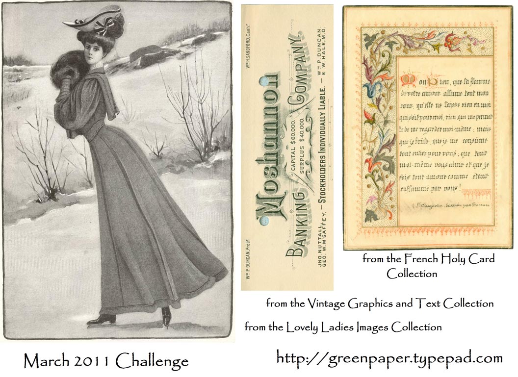
One of the challenges for December is in the section they call the Launch Zone and this month the challenge was to use the provided template (first image). I'd never used a template before and didn't have much of a clue what to do, so I printed off the tutorial they linked to, opened up the trial version of PS CS6 that I'd just downloaded and went to work.

Talk about a learning curve... new program, new technique. Oy. Made my head hurt. But I fired up the Keurig, made a hazelnut cappuccino, and struggled thru the first twenty minutes until things began to make sense enough for me to move right along.

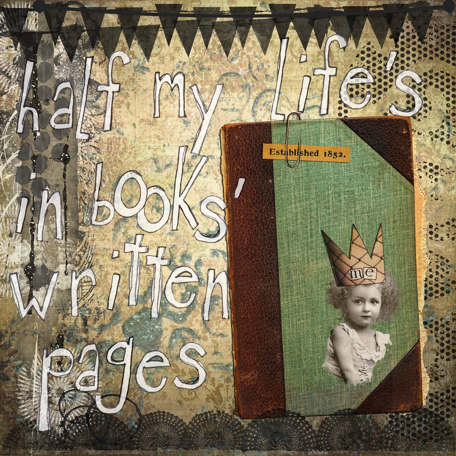
So the 2nd image was made in PS CS6. The photo is my great grandpa around 1895, dressed up like the town dandy, posing in a photo studio.

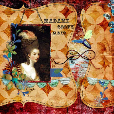
I made the 3rd image in Elements 11 using the same template. I figured doing the same exact task in both programs would go a long way to reassure me that I could do just fine with Elements and save the PS CS6 money for something else, and it did. I left most of the template elements intact because I wanted to see the program difference between the two pages when I was done and not be distracted by different elements. I like them both altho the colors in the blue one appeal to me more.

credits: template - Rosey Posey, flying bee - Lorie Davison Quieter Than Daylight kit, all other elements - AJC12 and AJC13 by Tangie


Tuesday, November 6, 2012

MWO challenge

Another month, another challenge from Gail at Shabby Cottage. Here's mine, digital again. She supplied the digital collage image in the frame - the woman, roses, Eiffel tower, "Paris". I added the frame and all the other stuff.

I debated doing this because of the voting. I have a problem with being one of the losers. Not that I have to win everything, but years ago I quit entering contests because it was depressing to me to not do well. Comparison is the thief of joy, as the saying goes. However, I liked this image and figure I just won't go look at the blog while the voting is going on. Check the link above in a few days cause it's a lot of fun to see what everyone did with the same image. And you can vote, if you're so inspired.

Click on image for a bigger view.


Sunday, August 5, 2012

savvy traveler

Mary Green and her monthly collage challenges are back! Yay! As always, you must use at least part of all three images. Like the last few, I went digital with this. I love paper and glue but merging 3 such different elements is a lot more fun for me in photoshop.

Used the map as the background, with two overlays - a grungy one and an old film one. There are various other things in the background - newspaper in the top left corner, part of a handwritten letter along the left edge, a collage of health product packaging along the top.

Made the woman from various parts and pieces, and then put a frame around her head. Duplicated the ticket a couple times. Dropped a frame onto the fig label and then put it on a red background so show it would show up against the grungy map.

The savvy traveler (yes I know it's spelled wrong in the collage but it sooo looks like it should have two Ls doesn't it?? and by the time I realized it, I had already merged the layers) font is "crow scratch" from Crowabout Studio B and the other elements are from Tangie Baxter and Deviant Art.  I'm really working on adding lots of elements and packing more onto the page, not for the sake of using lots of stuff, but to make it more interesting to look at, and I'm pleased with this one. Glad you're back, Mary! Bet you never envisioned your elements ending up like this, huh?!? LOL

Thursday, May 3, 2012

half my life

I've always loved this line from the song and had enough time over the weekend to sit down and really spend some time playing in photoshop.

This is the most complex digital collage I've made so far and I'm quite happy with it. The little girl isn't me but I love her frizzed out hair and wistful little expression. I extracted her with a rough edge so that she blends a bit with the book. Added the torn paper peeking out of the book.

There are two papers plus an overlay for the background. Added the grungy cluster along the left, the turquoise sparkly sequin waste circles, the black dot curlycues at left and the top and bottom banners. I erased part of the paper clip to get it to look right, and tinkered with drop shadows but I'm doing them the lazy way, using the photoshop one instead of creating my own. When I have more time, I'll learn the better way. Did a lot of copies with different blending modes to get it all soft and oldish looking.

Love the font. It's called Crow Scratch from Crowabout Studios. She makes a lot of neat stuff. Most everything else is from Scrapbookgraphics. I've got to go find that macro that keeps track of every element you use so that it's easy later to give credit to all the right sources.

Thursday, March 1, 2012

Green Paper March Challenge

Time once again for Mary's monthly challenge. You can see the original images here, as well as the other entrants. The post will be updated with entries thru the 8th of March, so stop by toward the end to see them all. It's amazing how inventive some folks are. These really make me work because one of the images is usually black and white while the other two are color and I always have a tough time integrating them, but I'm happy with this one.

I went digital again. I'm having a lot of fun with Photoshop lately, trying all kinds of things just to see what happens. It's so much more forgiving than working with paper and glue, and the effects you can achieve are almost infinite.

I started with the image of the woman. I colorized her into a reddish hue. Then added an overlay of a map from the basic Art Journal Caravan package of goodies and tweaked the color, contrast and (something I can't remember) quite a bit. I then extracted the column of numbers from the attendance card and placed them down one side, again playing with the color and filter. Also extracted two words from the music sheet to play up her languid, sexy persona. And finally I added a splash of glittery sequin waste for some bling. Too much fun. Thanks, Mary, for another fun challenge.

Sunday, January 1, 2012

Mary Green's January Challenge

I love the challenges that she does each month, but you have only a week to get it completed and when it falls at a busy time, I can't always squeeze it in. But... today I worked my butt off until around 2:30, then came home and played around in PS CS2. I've been buying the occasional digital art pack from Studio Tangie in the hopes of getting better at digital collage. Mary's January Challenge became what you see here.

The elements in the challenge are the picture of the girl, a certificate and a card of flowers with a verse.

I played with a few different layouts, trying to put the girl on the certificate, trying to cut out the flowers to put them in her hair, but I'm just not that good in Photoshop yet and instead of getting all frustrated, I chose to frame them with frames from a digital pack.

With her crown, she looks like a princess, just hanging around the house, leaning on a table. I love all the layers of her dress. Wonder if she was dressed up to go someplace.

Thanks for a good challenge, Mary. I'm glad I got to play this time!

Tuesday, March 1, 2011

Green Paper March Challenge

This month's Green Paper challenge was these three images.


As always, you had to use at least part of all three in some sort of art. I went digital this time, and if any seasoned Photoshop people are reading this, please don't laugh cause my border is pretty hack.


Took me quite a while to figure out something to do with these three totally unrelated images. Which, of course, is why it's called a Challenge!

I cropped the French holy card so that I could use its 2-sided border to make a complete frame for the ice skating lady. Took me a fair amount of fiddling, and it's far from perfect, but my mad Photoshop skilz aren't stout enough yet to seamlessly pull off something like this.

But... it's not glaringly awful and the overall look is what I was going for.

I filtered the b/w lady to sepia so that she'd relate better to the colorful border. I matted the bank letterhead on a black rectangle to separate it from the pale background. Played around with advertising slogans for a while and ended up with what you see.

Friday, December 3, 2010

Green Paper December Challenge

Mary at Green Paper offers up three images each month. The challenge is to use all 3 in a collage of some type. Click on the link to see the 3 images before I futzed with them. I went digital this time, altho I think I'll do a traditional paper collage also, because I really like these images. Thanks, Mary!

My mad Photoshop skillz are coming along. All in all, I'm pretty happy with this. I flipped the image of the dancer so that she was leaned left, layered a grunge texture over her, tweaked the brightness and contrast, and... can't remember what else.

Then I layered the Presented certificate over her, dragging the bottom of it way past the bottom edge of the dancer so that the letters covered her body more than her face. Changed opacity and fill until I liked the look.

Then added the stamps. I played with layering them here and there, lowered opacity and fill until they didn't overwhelm the dancer.

Et voila - my first (but not last!) digital collage challenge piece.