Monday, September 30, 2013

retail therapy

I made a list before I went. Not a hard and fast list, but more of a guideline so that I wouldn't go berserk. Nasco is a teacher's supply place that carries a ton of art supplies, along with horse tack, hoof trimmers, syringes and all sorts of other interesting agricultural stuff. I didn't even know it existed until one of my art journal students asked if I'd been there.

Why, no I said. Shall we go?

So we did. There's a store with quite a bit of stuff but the vast majority you ask for at the desk and they go pick it from a huge warehouse that you can peek at thru swinging doors.

There is a ton of half price stuff in the store and that's where I got into trouble.

A whole bin of brand name acrylics for 75% off? Don't mind if I do.

Pads of Stonehenge paper half price. Yes sirree Bob.

On and on. I just kept dropping stuff into my cart and tried not to think about the total.

Once we were done ransacking shopping the store, we put in our whse order which took only a few minutes, about as long as it took me to unload my shopping cart!

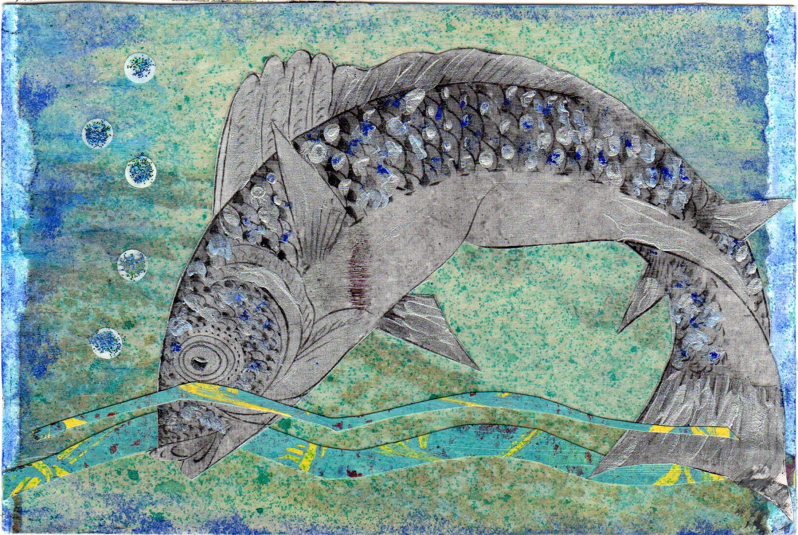
I came home with a few things I've been unable to find locally - PVA glue for bookbinding, workable fixative, bookbinding needles, the Stonehenge paper, stamp carving rubber, plus *lots* of stuff from the closeout section - Elmer's art paste for paste papers, ATC blanks in the assorted pack and a pack of bamboo paper ones, rubbing plates, a small visual journal, a pack of turquoise and brown handmade papers, a big bottle of matte gel medium.

All I can really say is that my friend's total was more than mine, and I did get a ton of cool stuff.

Now to find room for it in the studio.


WHEEEEEEEEEEEEEEEEEEEEEEEE!!!!!!!!!!!


Sunday, September 29, 2013

received art

A lovely card on the theme 'white' from my mail art friend Constance Rose.  The lower left piece is rustic handmade paper with bits of fibers in it. I love the stack of books with their covers removed. It makes them such a good neutral accent, especially with the raffia tie. The neat numbers on the bit of old ledger paper is wonderful. One of my all-time favorite cards. Thanks, Connie!

A very cool card on the theme of... trees from Sherry in Alaska. Never would have guessed since it's got fish all over LOL. Love the colors. It was inspired by this quote:

“Everybody is a genius. But if you judge a fish by its ability to climb a tree, it will live its whole life believing that it is stupid.”

― Albert Einstein

Another one from Connie on the theme of Autumn. Her backgrounds are one of the things I like most about her art. They're pretty much always hand painted, often scraped, with stamps and stenciling, and they're just great. I'm going to start doing more of that myself  instead of whipping out the gelli plate every time. Love the twisted handle on that one pumpkin. My mom always picked pumpkins with cool handles so this immediately made me think of her. Thanks, Connie!

A small work of art by Honi in New York. She does her cards on matt board with beveled edges, so they're classy even before she adds any art! This card has four layers of paper, plus the raffia tie
and a clear raised disk over the leaves. Very nice. I have at least two like this from her now, maybe three, and think I'll make a little display with them.


fossil paintings

My art friend Rhonda introduced me to these. A watercolor artist named David Castle makes what he calls "elementals", paintings composed of smaller elements. One of those elements are 'fossil' paintings that he makes using a flat stone as a resist. By looking at the photos and reading a few of his posts, we were able to (mostly) figure out how he does them and gave it a try a couple Sundays ago.

After reading a bit further today, I realize that he starts with a few layers of wet paint before he sets the rock down in it. I started mine with just setting the rock down, then dribbling paint and ink over it. In any case, I like the ones I made and plan to keep playing with this cause I love the effect.

The first four are all about 3" square and done with one rock on cheap 90lb watercolor paper. The last one had 3 rocks on it and is about 8" square. It was on 140lb watercolor paper which I sprayed with water before dropping the paint over the rock. 

The first one was done with Moon Shadow Mist in Tawny Turquoise. It's gorgeous in person. I bought 4 colors of their spray inks a couple years ago and haven't used them much but will try the other three with more fossils. 

The others are mostly Dyelusions inks and Distress Stains. I didn't do any with watercolors like David does them but will give that a try next.

This is an easy an interesting thing to try. All you need is some heavy paper, a few flat-bottomed rocks, and liquid color of some sort - watercolors, inks, fluid acrylics.


Think I'll cut some postcard sized paper and get some started...


Friday, September 27, 2013

notched journal swap

first one
Another MMSA swap. Those are pretty much all I do any more. I get pretty good stuff back and I like her themes.


These are journals you can make from old greeting cards or decorated papers. You stack them up, cut notches in each end for your binding string to slot into and you're done. 


I used a bunch of my paste papers from that great day in Niles at Maria's studio. The backs of them were plain so I painted them up mostly with watercolors, then cut them into various sizes so that more than just the cover page shows from the front.


second one, front

second one, pages
third one, front

third one, pages


day of the dead swap

This one is the top corner of a file folder.
I have to say that the day of the dead wasn't a holiday I paid much attn to in the past. However, this year Karen at MMSA is having a postcard swap on that theme, so when Rhonda came over on Sunday, she brought a huge bag of DOD rubber stamps. LOTS of them. I had no idea it was such a *thing* for some folks. So we made some cards, among other things.

It was one of those weird days when neither of us was especially inspired, so we get started on something, thrash around for a while, then one of us would say, "Ya know, I'm really not feelin this much, think I'll work on something else." So we'd pack up whatever it was we had out and get out the next project.

We ended up not getting anything finished but got several things started which worked out well cause I've gone back and finished them all week. These cards have gelli print backgrounds with stamps and some lettering, and on one of them I drew a sugar skull and colored it in with Copic markers.


Sunday, September 22, 2013

outgoing, eventually

Been making batches of mail art but my head's been in a odd place lately and when I look at these the next morning, it feels like someone seriously off their meds broke into my studio and made a bunch of postcards. Weird postcards. Postcards that sorta make me scratch my head and wonder what in hell I was thinking.

But at least I'm making art. 

More or less lol.


This one and the two below it are for an MMSA swap
where you need to use recognizable pieces of security envelopes,
the insides with the little patterns.


Saturday, September 21, 2013

incoming mailart

I'm behind posting incoming art but just scanned a bunch more.
The colors in this are lovely. It's from an MMSA swap where you had to use
only the elements on a provided collage sheet.
Those are always fun cause the cards are all wildly different from one another,
yet all made with the same basic stuff. This one's from Christie J.

This wild thing is from Katie R and it's made from plastic grocery bags fused together.
I don't even know how you do that! Then painted with all sorts runny colors
 and it looks sort of organic. A very cool card from the anything-but-paper MMSA swap.

Another from the anything-but-paper swap, this one's painted onto a piece of clear acrylic.
The sunflower is metallic in person and much more exciting than the scan shows.
Neat idea from I don't know who cause it isn't signed!

A card from the MMSA purple swap, made by Helga.
It's a bit more subdued in person and has every color of purple there is on it.
Love all the different shapes.

This one's from Karen M in thanks for a card she commented on that I went ahead and sent to her.
This card has a lot of interesting marks on it and I've looked at it quite a bit,
 trying to figure how she made them all. I'm not normally much of a primary colors person
but I like this particular card a lot.

This is an ATC from Thealie in France, from an exchange at creativesouls.ning.com.
This wasn't even the card from the theme, just an extra she sent along.
 Lots of texture and neat colors.


Sunday, September 15, 2013

MMAJRR - Paula's journal

MMAJRR is mixed media art journal round robin. Our first round is complete and we'll be mailing our journals off to the next person tomorrow. I worked in Paula's journal and her theme was a walk in the woods, which I liked a lot. Her journal is 5" tall and 16" wide when open so I'm showing each side of the spread separately.

LEFT PAGE OF SPREAD

RIGHT PAGE OF SPREAD

For this spread, I worked a lot of acrylic paint into the background, rubbing it around with baby wipes, adding yellows and oranges until I had a good base, then a bit of turquoise here and there. In person it's very smooth and has a bit of a gleam, like polished leather. Very pretty. Tore some images from my 1966 Reader's Digest Complete Book of the Garden. Used gel medium to put them down, then did a bit of coloring with Copic markers. Added various styles of lettering with Pitt Artist pens.

LEFT PAGE OF SPREAD


RIGHT PAGE OF SPREAD


The background for this one is watercolor, wet-into-wet stripes across the spread, then sprayed with water so it would run. The trees are sepia ink, dribbled along the bottom edge of the page and then blown with a straw up and out to form the branches. I'd sort of forgotten about this technique and don't remember why I thought of it but after practicing on a scrap page, I did it in Paula's journal and was happy with the results. I also wrote the haiku:

stark against the sky
trees stand bare and black
winter is coming...

I'd forgotten how much fun round robins are. Can't wait to see what the theme of the next journal is!

catching up... part 1

I've been in one of those funks where I come home from work and all I wanna do is sit on the couch and read. It didn't help that I had a really good book going and was practically reading at traffic lights to see what happened next. But I finally finished the damn thing and got back to real life. I do love a good book but it sort of puts everything else on hold.

Lots of art has arrived and I've just scanned a bunch of it after thanking the various senders. MMSA swaps, private swaps, little gifts - all sorts of good stuff.

This went out to one of my ongoing private swaps.
Love the goofy images on this card.
They both came from a magazine full of ads for
art galleries. I added a few things and some
doodles and like it a lot.

Incoming from Peggy in CO. I admired it on MMSA when
Karen posted it and Peggy was nice enough to send me a copy
of it in case I don't get the original in the swap.
Love the colors and the composition and the
squiggly border. Just a great piece of art.

One from Connie Rose. The stenciled dots are metallic bronze
and the whole thing just shimmers. Our private swap theme
was purple and this card is a lovely take on an ocean sunset.

Another from Peggy. Love the limited palette and the odd shapes,
kind of a spiral around the bird, and the doodles. Another cool
one, Peggy.

Put a fish on it swap - from Noel in AZ.
The fish is a vintage Asian illustration embellished with
metallic paint. Neat card.

Put a fish on it swap - from Linda in MA.
Good colors, fun dots and mysterious caption.
Put a fish on it swap - from Mandy in MA.
Great background, lots of paint and collage,
and really pretty fish.


Tuesday, September 3, 2013

postal ATCs

Here are the ATCs I got in return for the three I sent in a few weeks ago. Remember - despite the size they appear in this post, these are just 2.5" x 3.5", the size of a regular playing card. Lots of art going on in such a small space, the reason I love ATCs so much. You have to pay attention and get it right to fit everything in - a story, color balance, good scale. These artists all did a good job of that.
Made mostly, if not entirely, from vintage materials, this ATC is lovely.
Good colors, nice balance and scale. Love the old handwriting.
And no surprise, it's made by Pamela of CappuccinoAndArt,
a specialist in postal themed ATCs.
Thanks, Pamela - love it.

This cutie was made by Christie on nice heavy watercolor paper
and features a vintage mailman delivering the mail
right into the lady's hand. Don't get service like that anymore.
The background is painted or gelli printed and
looks like a cloudy sky - very nice!

This serene little piece of art was made by Jan.
I love the colors in this one -
reminds me of a wheat field on a summer's day.
All the different patterns going on - the background paper,
the diamonds, the stamps, the circles - really keeps you looking at it.